

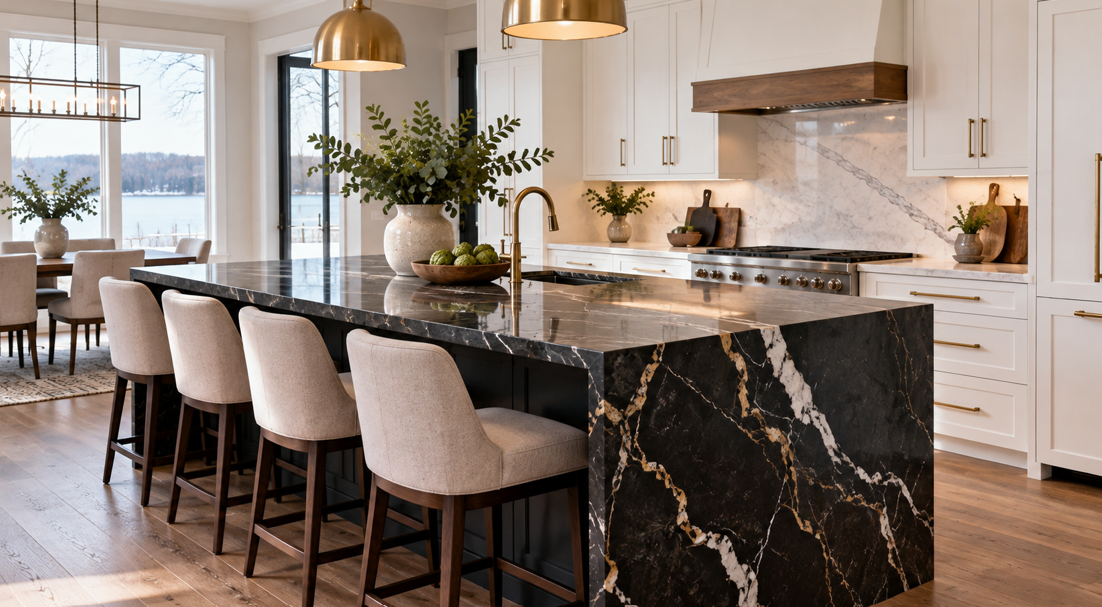
A kitchen island already tends to be one of the hardest-working features in the room. It may serve as a preparation zone in the morning, a homework station in the afternoon, a casual dining spot at dinner, and a gathering place when friends or family visit. Giving that island a countertop that intentionally contrasts with the rest of the kitchen can turn it into a true design focal point.
For White Bear Lake homeowners, contrasting countertops offer an opportunity to add personality without making the entire kitchen feel overly dramatic. A dark island can anchor a light kitchen. A richly veined stone can introduce movement beside quieter perimeter surfaces. A warm wood-look or natural-toned surface can soften a room filled with crisp cabinetry and polished finishes.
At Abbott Paint & Carpet, we help Twin Cities homeowners bring individual design ideas together into spaces that feel balanced, practical, and personal. When it comes to statement kitchen islands, the key is not simply choosing two different countertop colours. The most successful combinations feel intentional.
This guide explores how to choose a contrasting island countertop, which colours and materials can work together, and how White Bear Lake homeowners can create a kitchen island that stands out for the right reasons.
What Is a Contrasting Kitchen Island Countertop?
A contrasting island countertop is a surface intentionally selected to differ from the countertops around the perimeter of the kitchen.
The contrast can come from several design elements:
Colour.
Pattern.
Veining.
Material.
Texture.
Finish.
Thickness.
Edge profile.
For example, a homeowner might pair soft white perimeter countertops with a charcoal island surface. Another kitchen might use the same basic colour family but introduce a much more dramatic veining pattern on the island.
Contrast does not necessarily mean creating an extreme black-and-white combination.
A subtle difference can be just as effective. Warm cream perimeter countertops paired with a richer taupe island can create depth without dominating the room. A softly patterned quartz around the perimeter could be paired with a bolder natural-stone look on the island.
The goal is to make the island feel distinctive while keeping it connected to the kitchen as a whole.
Why Statement Islands Work So Well in Modern Kitchens
Kitchen islands naturally attract attention because of their location.
In many open-plan homes, the island is visible from the living room, dining room, or entry area. That gives the countertop an unusually important role in the overall interior design.
A contrasting surface can help the island become an architectural centrepiece rather than simply another run of cabinets.
Contrast Creates Visual Depth
When every cabinet and countertop uses the same colour, the kitchen can appear very uniform.
That may be exactly the look some homeowners want, but others prefer more visual layering.
Introducing a contrasting island creates another level of depth. The eye has somewhere to land, and the island becomes a natural point of focus.
It Adds Personality Without Changing Everything
A statement island can be an approachable way to introduce a bolder material.
Perhaps you love dramatic veining but feel it would be too busy across every countertop. Using it on the island allows that surface to become a feature while quieter perimeter countertops keep the kitchen grounded.
The same idea works with colour.
A deep charcoal, warm brown, rich cream, or other distinctive tone can feel more comfortable when concentrated on the island.
It Helps Define an Open-Plan Space
In open kitchens, a contrasting island can visually separate the kitchen from nearby living areas.
The change in material or colour signals that the island is a destination within the larger room.
For White Bear Lake homes with open living and dining layouts, that distinction can help the kitchen feel designed rather than simply placed along one side of a larger space.
Start with the Overall Kitchen Palette
Before choosing a statement countertop, step back and look at the entire kitchen.
Countertops are only one part of the design. Cabinet colour, flooring, backsplash, hardware, appliances, wall colour, lighting, and natural light all contribute to the final result.
A successful island surface usually connects with at least one or two elements elsewhere in the room.
For example, dark veining in the island may relate to black cabinet hardware. Warm undertones in the countertop could complement the flooring. Creamy colours might connect to an off-white backsplash.
This type of repetition makes the contrast feel intentional.
Consider Undertones, Not Just Colour Names
Two countertops may both be described as white yet look completely different when placed beside each other.
One may have a cool grey undertone while another leans towards cream or beige.
Those differences become more noticeable when large surfaces are installed next to each other.
The same applies to greys, browns, blacks, and natural stone colours.
When comparing samples, look at how the undertones interact with:
Cabinet finishes.
Flooring.
Backsplash materials.
Wall colour.
Nearby wood tones.
Natural and artificial lighting.
A countertop does not exist in isolation, so seeing the material alongside the rest of the palette is extremely helpful.
Light Perimeter Countertops with a Dark Island
One of the clearest ways to create a statement island is to pair lighter perimeter countertops with a darker surface in the centre of the room.
This combination works particularly well in kitchens with white, cream, light grey, or natural wood cabinetry.
The darker island visually anchors the room.
Charcoal, deep grey, black, rich brown, and darker stone-inspired patterns can all create this effect.
Why the Combination Works
Light countertops around the perimeter help the room feel bright and open.
The darker island adds contrast without making every surface visually heavy.
This balance can work particularly well when the kitchen receives plenty of natural light.
In White Bear Lake homes where the kitchen opens into a bright family room or dining area, a darker centre island can create a strong visual feature while preserving an airy overall feeling.
Connect the Dark Surface to Other Details
One useful design technique is to repeat the darker colour elsewhere.
That might include:
Black pendant lights.
Dark cabinet hardware.
Window frames.
Bar stools.
A dark range hood.
Decorative accents.
Repeating the tone in a few places prevents the island from feeling disconnected.
Dark Perimeter Counters with a Light Island
The reverse combination can be equally effective.
A kitchen with darker perimeter counters can benefit from a lighter island surface that brightens the centre of the room.
This may be especially appealing in kitchens where the island is large.
A pale surface visually reduces the weight of the island and can reflect more natural and artificial light.
Soft white, cream, warm beige, and lightly patterned surfaces can work beautifully against darker surrounding counters.
A light island may also provide the perfect background for decorative pendant lighting, colourful seating, or a distinctive cabinet finish.
Pair Subtle Perimeter Surfaces with Bold Veining
Contrast does not have to come from colour alone.
Pattern is another powerful design tool.
If your perimeter countertops have a restrained appearance, the island can introduce stronger veining or more noticeable movement.
For example, a quiet white or soft neutral quartz around the walls could be paired with an island surface featuring broad grey, taupe, gold, or charcoal veining.
This creates a focal point while allowing the rest of the kitchen to remain calm.
When browsing countertops, comparing quieter designs with statement patterns side by side can make it easier to see how much contrast feels right for your space.
Let the Island Be the Feature
When the island countertop has dramatic movement, there is often less need for competing patterns elsewhere.
A simpler backsplash, understated cabinet style, or restrained flooring pattern can allow the countertop to take centre stage.
That does not mean every surrounding finish needs to be plain.
The idea is to establish a clear hierarchy so the room has a focal point rather than several surfaces competing for attention.
Use Warm and Cool Contrast Carefully
Colour temperature can influence how a kitchen feels.
Warm countertops often contain beige, cream, brown, caramel, or gold tones. Cooler surfaces may lean towards crisp white, blue-grey, charcoal, or cooler greys.
Mixing warm and cool materials can work, but the connection needs to feel deliberate.
A warm-toned island in a primarily cool kitchen may feel inviting if there are other warm elements nearby, such as natural wood stools or warm flooring.
Without those connections, the island may appear unrelated to the rest of the design.
For many homeowners, keeping the undertones somewhat related creates the easiest path to a cohesive look.
Consider the Island Cabinet Colour Too
The countertop is not the only opportunity for contrast.
Many statement islands use a different cabinet colour as well.
For example:
White perimeter cabinetry with a navy or charcoal island.
Cream cabinets with a natural wood island.
Light wood cabinetry with a deeper painted island.
Neutral cabinetry with a warm green or blue island.
Once the cabinetry itself contrasts, the countertop selection becomes even more important.
Decide What You Want to Emphasise
If the island cabinets are already bold, a quieter countertop may provide better balance.
If the island cabinetry is relatively neutral, the countertop can take on more of the visual drama.
Having both a very bold cabinet colour and a highly patterned countertop can work in the right space, but it creates a much stronger statement.
A restrained combination often has more longevity and makes it easier to update surrounding décor later.
Think About Flooring When Choosing Island Countertops
Flooring covers one of the largest visible areas in the kitchen, so its relationship with the countertop matters.
Warm wood or wood-look flooring often pairs beautifully with warm whites, creams, taupes, and natural stone tones.
Darker floors can support lighter countertops, while light floors can create space for deeper countertop colours.
If your flooring already has strong grain, movement, or colour variation, a quieter island countertop may provide balance.
If the floor is visually simple, there may be more room to introduce dramatic veining or pattern on the island.
Viewing countertop samples near the actual floor is particularly useful because showroom lighting may affect how colours appear.
Match the Material to How You Use the Island
A statement island needs to do more than look good.
Because islands are frequently the busiest work surfaces in the kitchen, practical considerations deserve equal attention.
Think about what happens there every day.
Is the island primarily used for food preparation? Does the family eat meals there? Do children do homework at the counter? Is it the main serving area when entertaining? Does it contain a sink or cooking surface?
These questions can help narrow the countertop choice.
Food Preparation
If the island is the main preparation area, easy everyday cleaning and durability may be particularly important.
Casual Dining
For islands with seating, consider how the material looks from the adjoining living spaces as well as from within the kitchen.
The edge profile also becomes more noticeable when people regularly sit around the island.
Entertaining
If the kitchen island often becomes a buffet, drinks station, or gathering point, a distinctive pattern can give the space an especially polished appearance.
Baking and Cooking
Homeowners who regularly bake or prepare large meals may place a higher priority on a smooth, generous work surface.
How the island functions can help determine whether the statement comes mainly from colour, pattern, material, or detailing.
Do the Island and Perimeter Countertops Need to Be Different Materials?
Not necessarily.
Homeowners can create contrast using two designs within the same general countertop category.
For example, two quartz surfaces could have different colours or patterns. That approach can create visual variety while maintaining some consistency in everyday care.
Another option is to pair different materials.
Different materials can create a stronger design statement, but they may also have different maintenance characteristics.
If you are considering a mixed-material kitchen, it is worth thinking about whether you are comfortable caring for each surface appropriately.
There is no requirement for the island to be dramatically different. The best combination is one that works for the design and the household.
Countertop Finish Can Create Subtle Contrast
Not every statement island relies on bold colour.
Finish can also create variation.
A surface with a softer, low-sheen appearance may provide an interesting counterpoint to more polished perimeter countertops.
Texture changes the way light interacts with the material and can make similar colours feel noticeably different.
This type of contrast is particularly useful for homeowners who prefer an understated kitchen but still want the island to feel special.
Finish availability and care requirements depend on the specific countertop material, so comparing actual samples can help.
Edge Profiles Can Make the Island Feel More Distinctive
The island is also an excellent place to consider a more noticeable edge treatment.
Because the surface is often visible from several sides, edge details receive more attention than they might on perimeter counters.
A thicker-looking edge can add visual weight, while a simpler profile can keep a dramatic stone pattern feeling clean and contemporary.
The best profile depends on:
Countertop material.
Island size.
Cabinet style.
Overall kitchen design.
Desired visual weight.
An island with a highly dramatic countertop may need very little additional detail. A quieter surface can sometimes benefit from a more distinctive edge treatment.
How Much Contrast Is Enough?
There is no formula.
Some homeowners want the island to be the first feature people notice when entering the kitchen. Others prefer a difference that becomes apparent only when looking more closely.
One helpful way to think about contrast is in three levels.
Subtle Contrast
Choose materials from similar colour families but vary the pattern, finish, or depth of tone.
This creates visual layering without a dramatic divide between the island and perimeter.
Moderate Contrast
Choose noticeably different colours while maintaining a common undertone.
For example, a warm cream perimeter surface might be paired with a medium taupe island.
Bold Contrast
Combine light and dark materials or introduce dramatic veining, strong colour, or an entirely different material.
This approach turns the island into a clear focal point.
The right level depends on the room and your personal style rather than a specific trend.
View Countertop Samples in Your Own Lighting
Colour can change significantly depending on light.
A surface that looks crisp white under showroom lighting may appear warmer in a kitchen with afternoon sunlight. Dark surfaces can reveal more subtle pattern when viewed beside a large window. Veining that feels prominent in a small sample may look different across an entire slab.
For White Bear Lake homeowners, viewing samples with the actual cabinetry, flooring, paint, and backsplash selections can make the decision much clearer.
Look at the samples at different times of day if possible.
Morning light, afternoon sun, and evening fixtures can all change how the countertop appears.
Avoid Making the Island Feel Unrelated to the Kitchen
Contrast works best when there is still a visual connection.
If an island looks as though it belongs in a completely different kitchen, the combination may feel more random than intentional.
Try to create at least one connection between the two countertop choices.
That connection might be:
A shared undertone.
Similar veining colour.
Repeated accent colours.
Matching finish.
Related material.
Coordination with the same flooring or backsplash.
Even a bold island can feel harmonious when these relationships are considered.
Build a Kitchen Around Your Own Style
Design trends can provide inspiration, but a kitchen is a long-term part of the home.
A contrasting island countertop is most successful when it reflects the homeowner's style rather than feeling like a feature added simply because it is popular.
Think about the rooms adjoining the kitchen.
If your home uses warm woods, natural textures, and relaxed neutrals, bringing those elements into the island can create continuity. If your interior has stronger black-and-white contrast or contemporary details, a more dramatic island may feel completely at home.
The goal is a kitchen that feels connected to the rest of the property and remains enjoyable long after the renovation is complete.
Make Your White Bear Lake Kitchen Island a True Centrepiece
A contrasting countertop can transform a kitchen island from a practical work surface into the feature that brings the entire room together.
Light and dark combinations create immediate impact, while differences in veining, texture, finish, or material can introduce more subtle distinction. The strongest designs consider the whole room — cabinetry, flooring, backsplash, lighting, hardware, and the way the kitchen is used every day.
For White Bear Lake homeowners, the right statement island does not need to be overly dramatic. It needs to feel intentional, functional, and connected to the character of the home.
Abbott Paint & Carpet helps homeowners throughout White Bear Lake and the wider Twin Cities area compare materials, coordinate finishes, and turn design inspiration into a finished space that works beautifully for everyday life.
If you are planning a kitchen renovation and want help bringing the pieces together, get in touch with our team. We can help you explore countertop options and create a kitchen island that feels distinctive without losing the balance and warmth that make the room inviting.


