

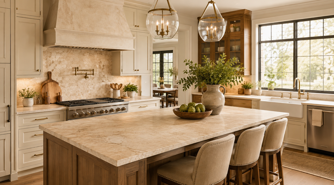
For years, cool grey countertops were the default choice for homeowners who wanted a kitchen to feel clean, modern, and easy to coordinate. Now, the mood is changing. Across Stillwater and the wider Twin Cities, more homeowners are choosing cream, taupe, beige, and other warm neutral surfaces that make kitchens feel softer, more welcoming, and more connected to natural materials.
Warm neutral countertops can feature quiet veining, subtle movement, soft mineral tones, or a gently textured finish that adds depth without overwhelming the room.
At Abbott Paint & Carpet, we help homeowners bring flooring, paint, window treatments, and countertop choices together into one cohesive design. For Stillwater kitchens, warm neutral surfaces are proving especially appealing because they suit historic homes, modern renovations, and everything in between. Here is why the trend is growing, how the main colours differ, and how to choose a warm countertop that feels current for years to come.
Why Are Warm Neutral Countertops Replacing Cool Grey?
The move towards warmer countertops reflects a wider change in interior design. Homeowners still value clean lines and uncluttered spaces, but many no longer want kitchens to feel cold, stark, or overly polished. They are looking for rooms that feel comfortable, lived-in, and personal.
Cream, beige, and taupe connect naturally with materials that are popular in current kitchens. White oak cabinetry, walnut accents, brushed brass, handmade tile, warm white paint, and natural stone all sit comfortably beside a warmer countertop. Instead of acting as a sharp contrast, the countertop becomes part of a layered palette.
This shift is particularly relevant in Stillwater, where many homes have architectural character, natural woodwork, river-town charm, or traditional details. A warm neutral surface can respect that history while still supporting a fresh renovation.
What Counts as a Warm Neutral Countertop?
Warm neutral is a broad category rather than one exact colour. It includes countertop shades with cream, tan, beige, brown, gold, or muted red undertones.
Cream is usually the lightest option. It feels softer than bright white and can brighten a kitchen without creating a stark contrast. Beige offers more visible warmth and often works beautifully with natural wood. Taupe sits between beige, grey, and brown, making it especially useful when a kitchen includes both warm and cool finishes.
Other warm neutrals include mushroom, sand, putty, oatmeal, camel, and warm greige. Some surfaces appear nearly white from a distance but reveal gold, caramel, or taupe veining up close. Others have a richer background with small flecks or mineral movement.
The most important distinction is undertone. Two countertops may both be labelled beige, yet one may lean yellow while the other feels pink, brown, or grey. Looking at samples in the actual kitchen helps reveal how those undertones respond to cabinetry, flooring, wall colour, and daylight.
1. Cream Countertops Create Soft Brightness
Cream countertops are ideal for homeowners who like the lightness of white but want a kitchen to feel warmer and less clinical. A cream surface reflects plenty of light while adding a subtle sense of softness.
This colour works well in Stillwater kitchens with limited natural light because it keeps the room bright without feeling icy. It can also soften the contrast between dark cabinetry and a pale work surface.
Cream countertops pair especially well with white oak, medium-toned wood, warm white cabinets, muted green paint, and brushed brass hardware. In a traditional kitchen, they can feel classic and refined. In a modern kitchen, a simple cream slab can look clean and understated.
Veining makes a significant difference. Soft taupe, gold, or caramel movement adds character while keeping the overall effect calm.
2. Taupe Bridges Warm and Cool Finishes
Taupe has become one of the most useful countertop colours because it sits between beige, brown, and grey. It can warm up a cool kitchen or bring balance to a room that already contains several wood tones.
This flexibility makes taupe a strong choice for renovations where not every surface is being replaced. A homeowner may be keeping stainless steel appliances, a grey tile floor, or existing painted cabinetry while adding warmer wood accents. Taupe can connect those elements without making the room feel mismatched.
Light taupe surfaces create a quiet, elegant effect, while deeper taupe adds richness and contrast. Some taupe countertops have very little pattern; others include cloudy movement or subtle stone-inspired veining.
3. Beige Is Returning in a More Refined Form
Beige once had a reputation for feeling predictable, but today’s beige countertops are more nuanced. Instead of flat tan surfaces, homeowners can choose layered colours inspired by sand, limestone, travertine, and natural clay.
Modern beige often includes subtle movement, small mineral details, or veining in cream, brown, and soft grey. These variations give the surface depth and prevent it from feeling one-dimensional.
Beige is especially appealing in kitchens with medium or dark wood cabinetry. It creates contrast without the sharpness of bright white. It also works well with painted cabinets in warm white, olive, sage, muted blue, and earthy terracotta tones.
4. Warm Greige Offers an Easy Transition
Some homeowners are not ready to move entirely away from grey. Warm greige provides a comfortable transition by combining grey’s versatility with beige’s softness.
A warm greige countertop can coordinate with existing grey flooring or appliances while introducing enough warmth to support wood cabinetry and creamy wall colours. It is a practical option for partial renovations because it can unite old and new finishes.
Because Stillwater homes experience major seasonal changes in daylight, viewing a sample in morning, afternoon, and artificial light is worthwhile. A colour that feels perfect in the showroom may reveal a different undertone once it is placed beside the kitchen’s permanent finishes.
5. Warm Veining Is Replacing Sharp Contrast
The colour shift is not limited to the countertop background. Veining is becoming warmer too.
Instead of crisp charcoal lines on a bright white surface, many homeowners are choosing softer movement in taupe, gold, caramel, beige, and muted brown. These colours create visual interest without making the countertop the loudest element in the room.
Warm veining can connect multiple materials. A gold-toned vein may relate to brass hardware, while a taupe vein can pick up the colour of the floor or backsplash. Brown and caramel movement can echo natural wood cabinetry.
Large-scale veining creates a statement, especially on an island. Fine, delicate veining feels quieter and more traditional. The right choice depends on the size of the room, the amount of visible countertop, and how much pattern is already present elsewhere.
6. Honed and Matte Finishes Strengthen the Warm Look
Polished countertops remain popular, but honed, matte, and softly textured finishes support the warm neutral trend particularly well. They absorb rather than reflect strong light, allowing cream, taupe, and beige tones to appear deeper and more natural.
A honed finish can give stone or stone-look surfaces a relaxed, tactile quality. It often works beautifully in kitchens designed around natural materials, understated cabinetry, and layered lighting.
Homeowners can explore Abbott’s range of countertops to compare colour, veining, material, and finish options. Seeing several samples together often makes it easier to recognise whether a kitchen needs soft cream, adaptable taupe, refined beige, or a warmer greige.
7. Warm Neutrals Make Two-Tone Kitchens Feel More Cohesive
Two-tone kitchens often combine painted perimeter cabinets with a wood island, or light upper cabinets with darker lower cabinets. Warm neutral countertops can connect those different finishes.
A cream surface may brighten both cabinet colours, while taupe can bridge a cool painted tone and a warm wood grain. Beige can ground a large island and make it feel like a piece of furniture rather than a separate block in the room.
This is where a full-room design perspective becomes valuable. Cabinetry, flooring, paint, backsplash, hardware, and lighting all influence how the countertop reads. A surface that looks neutral by itself may appear surprisingly warm or cool once it is placed in context.
Which Countertop Materials Work Well in Warm Neutral Colours?
Warm neutral shades are available across several countertop materials. Each offers a different combination of appearance, maintenance, and performance.
Quartz
Quartz offers a wide range of consistent cream, beige, taupe, and greige colours. It can imitate marble, limestone, or soft concrete while providing a non-porous surface that is straightforward to maintain.
Homeowners who want predictable pattern placement and a controlled colour palette often find quartz appealing. Options range from nearly solid warm white to bold surfaces with sweeping gold and taupe veining.
Quartzite
Natural quartzite can feature beautiful warm backgrounds, crystalline depth, and dramatic mineral movement. Cream, beige, tan, and gold tones are common in many varieties.
Because quartzite is a natural stone, every slab is different. Viewing the actual slab is important, especially when the pattern will continue across a large island or prominent backsplash.
Granite
Granite offers a broad range of warm neutrals, from creamy stone with fine mineral flecks to richer beige and brown patterns. It can be an excellent choice for homeowners who appreciate natural variation and durability.
The pattern tends to be busier than many quartz designs, so it works best when coordinated carefully with flooring and backsplash materials.
Marble
Warm marble can create a soft, elegant look with cream backgrounds and beige, gold, or taupe veining. It develops character over time, which many homeowners consider part of its appeal.
Because marble requires thoughtful care, it suits homeowners who value its natural beauty and are comfortable with the way the material may age.
Solid Surface and Other Options
Solid-surface materials can provide smooth, consistent warm colours with minimal pattern. Porcelain and other engineered surfaces also offer stone-inspired designs in cream, taupe, and beige.
How to Pair Warm Countertops with Cabinets
Cabinet colour is one of the strongest influences on countertop selection.
Warm white cabinets pair naturally with cream, taupe, beige, and warm greige. The result is layered and subtle rather than high contrast. Wood cabinets often benefit from a countertop that is lighter than the cabinetry but shares a related undertone.
Sage, olive, and muted green cabinets work beautifully with cream and beige surfaces, especially when the countertop contains warm veining. Deep blue cabinets can feel less formal when paired with taupe rather than bright white.
For dark brown, charcoal, or black cabinets, a pale warm countertop adds contrast while keeping the room inviting. A cream surface with gold or taupe movement can prevent a dark kitchen from feeling severe.
When the cabinets and countertop are similar in colour, texture becomes important. Veining, edge detail, backsplash pattern, and finish help create definition.
How Flooring Influences the Countertop Colour
Flooring is sometimes overlooked during countertop selection, but it can determine whether a warm neutral palette feels balanced.
Natural and warm-toned wood flooring usually pairs easily with cream, beige, and taupe. The countertop does not need to match the floor exactly. It simply needs an undertone that feels related.
If a kitchen has cool grey flooring that will remain, warm greige or taupe may provide the smoothest connection. A very yellow beige could create too much separation, while a balanced taupe can bridge the floor and warmer cabinetry.
Pattern also matters. A highly varied floor may call for a quieter countertop, while a simple floor can support more dramatic veining. Viewing the materials side by side is the most reliable way to avoid competing undertones.
Choosing a Warm Neutral That Will Last
A countertop is a major visual surface, so it is understandable to wonder whether warm neutrals will remain appealing after the trend changes.
The most enduring choices are usually rooted in natural materials. Cream limestone, beige quartzite, taupe clay, and warm marble have influenced interiors for generations. Current products may interpret those colours in a fresh way, but the palette itself is not new.
A surface with moderate movement and an undertone already present elsewhere in the home can offer lasting flexibility. Very bold veining can be beautiful, while a quieter pattern may adapt more easily to future paint and décor changes.
Frequently Asked Questions About Warm Neutral Countertops
Do Warm Countertops Make a Small Kitchen Look Darker?
Not necessarily. Light cream, pale beige, and soft taupe can keep a small kitchen bright while reducing the starkness of pure white. Cabinet colour, lighting, and backsplash choices also affect the overall result.
Can Warm Countertops Work with Stainless Steel Appliances?
Yes. Taupe and warm greige are particularly good at connecting stainless steel with wood, brass, and warm paint colours. Cream and beige can also work when the room includes another element that relates to their undertone.
Are Beige Countertops Dated?
Today’s beige surfaces are more layered and natural than many older designs. Refined veining, honed finishes, and stone-inspired colour variation can make beige feel current and sophisticated.
What Backsplash Works with Warm Neutral Countertops?
Warm white tile, handmade-look ceramic, natural stone, and a matching slab backsplash can all work well. The backsplash is best chosen after the countertop so its undertones and pattern support rather than compete with the main surface.
Can I Mix Warm and Cool Neutrals?
Yes. A successful mixed palette usually includes a bridging colour such as taupe or warm greige. Repeating each undertone elsewhere in the room helps the combination feel intentional.
Bring Warmth Back to Your Stillwater Kitchen
Cream, taupe, beige, and warm greige countertops are replacing cool grey because they make kitchens feel softer, more natural, and more welcoming. They work with wood cabinetry, painted finishes, modern hardware, traditional details, and the changing Minnesota light.
The best choice depends on more than the colour name. Undertone, material, veining, finish, cabinetry, flooring, and lighting all influence how the countertop will look in the completed room.
Ready to compare warm neutral surfaces for your Stillwater kitchen? Visit Abbott Paint & Carpet in Stillwater, White Bear Lake, or St. Paul, or get in touch with our team. Our experienced designers can help you review samples, coordinate surrounding finishes, and choose a countertop that makes the entire kitchen feel connected.


